WeRoad Reunion Weekend
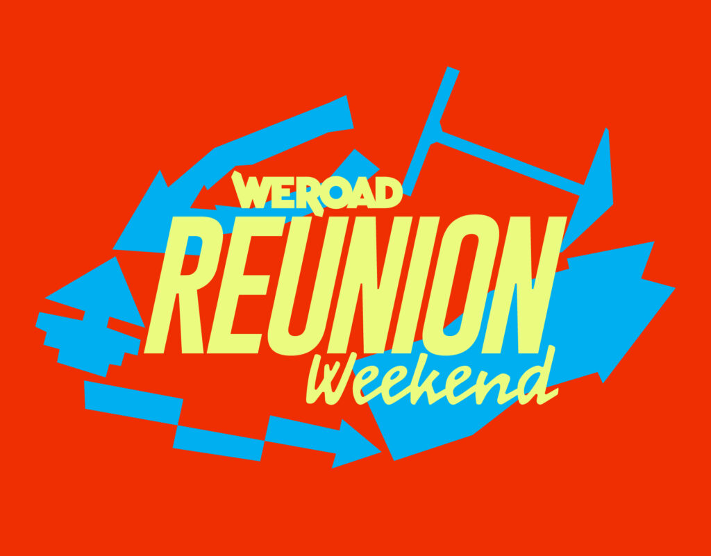
The arrow acts as a key visual, starting as a symbol and concept, and becoming a recognizable graphic element both across the festival’s physical spaces and in its digital presence. Ultimately defining the visual language used through the identity and its illustration, using a broken line, sharp but manual and warm. The Reunion was structured […]