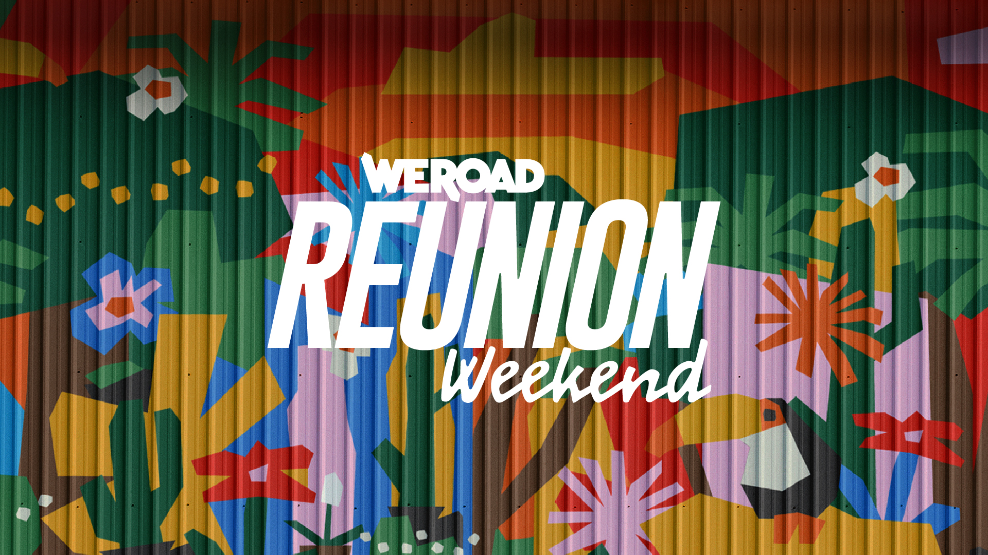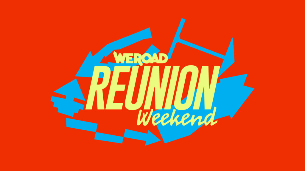
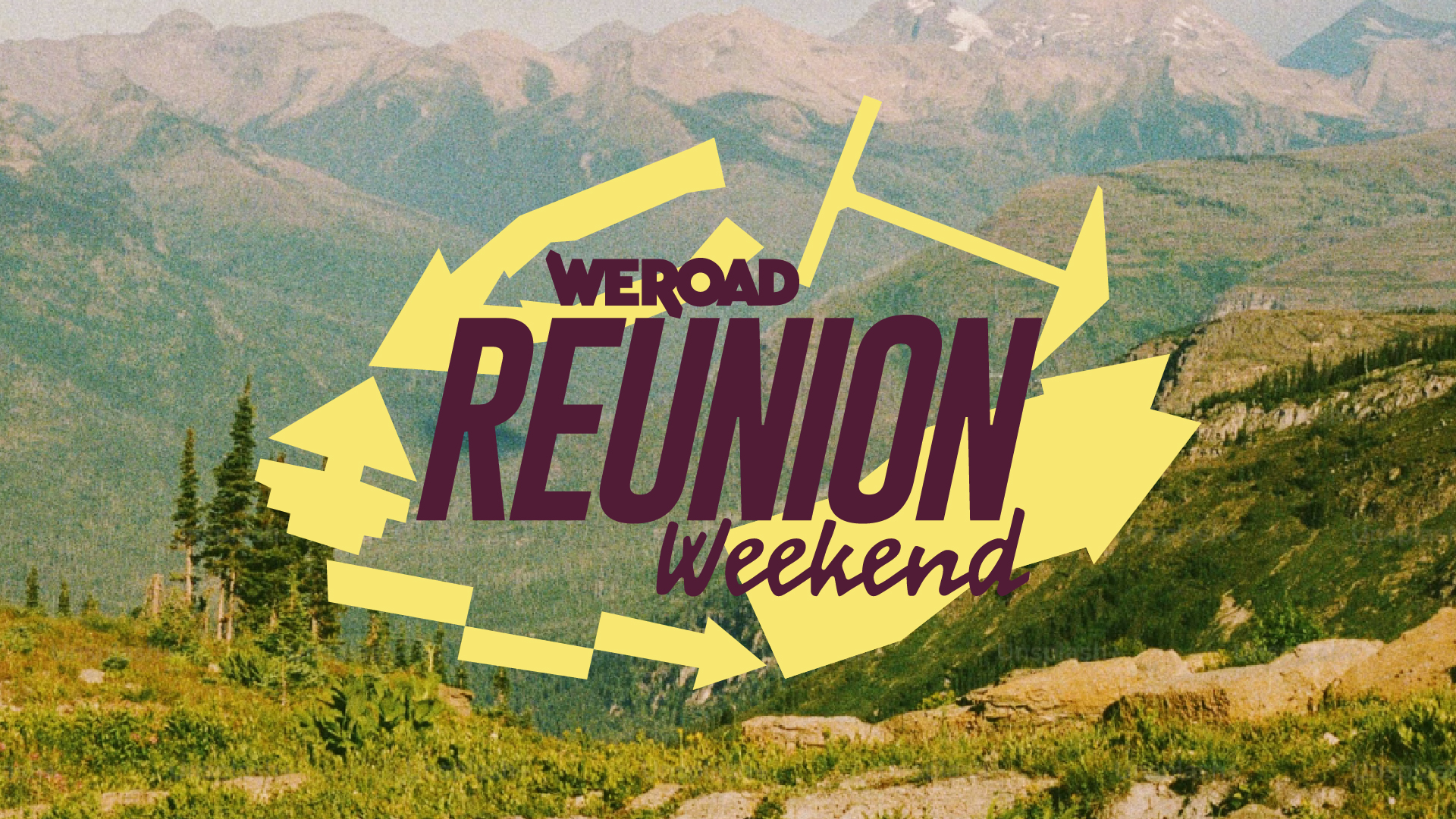
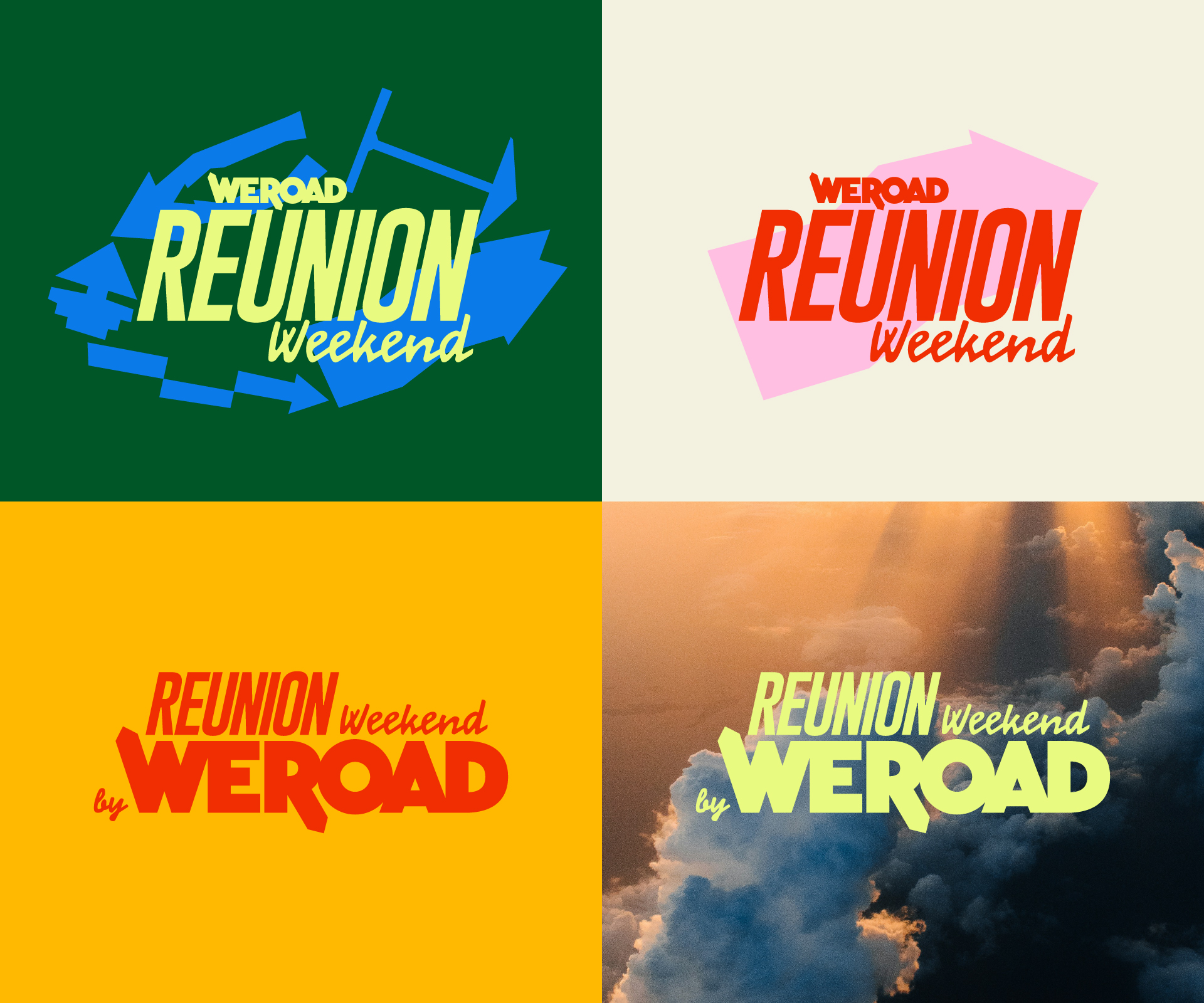
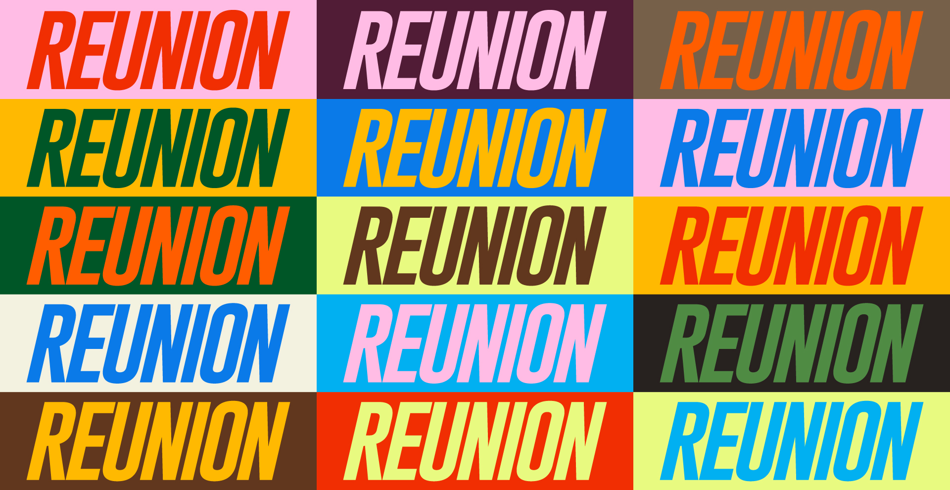
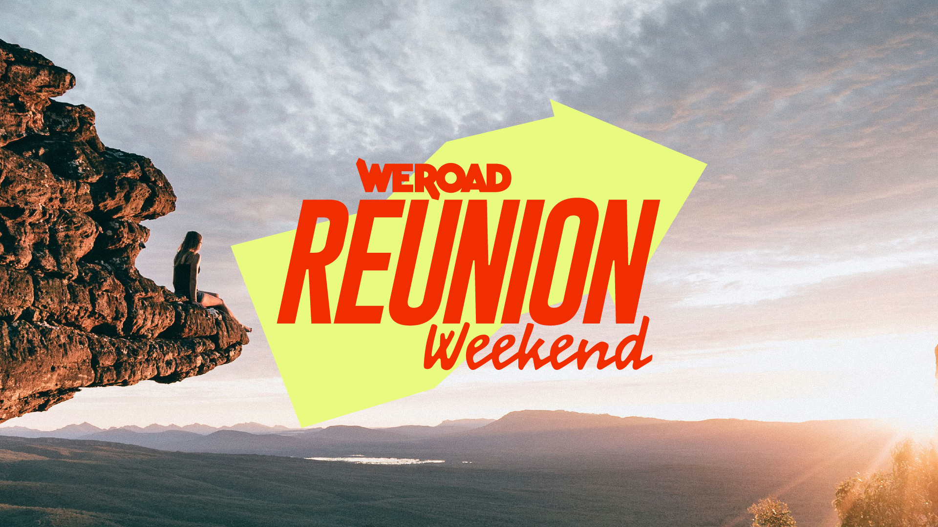
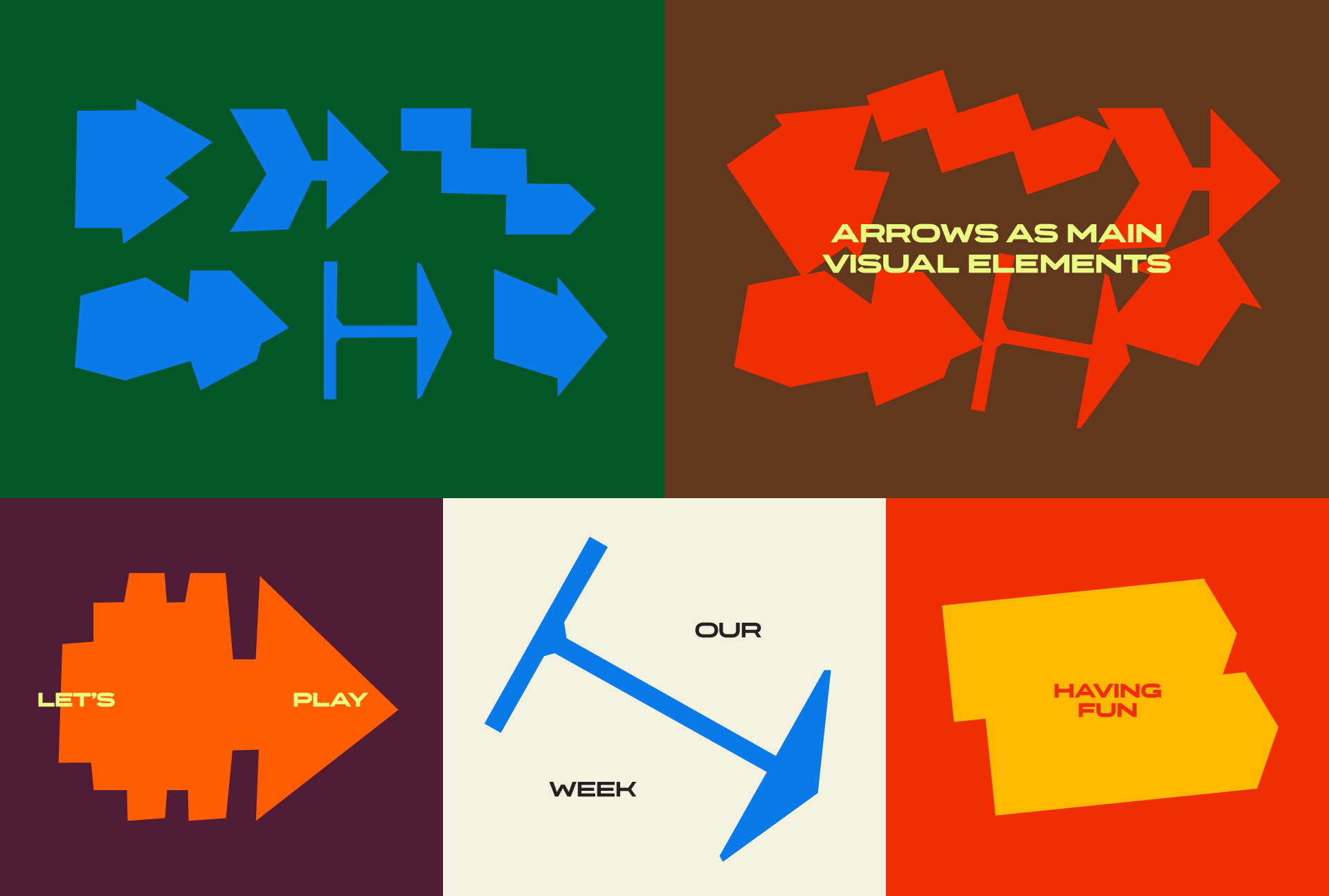
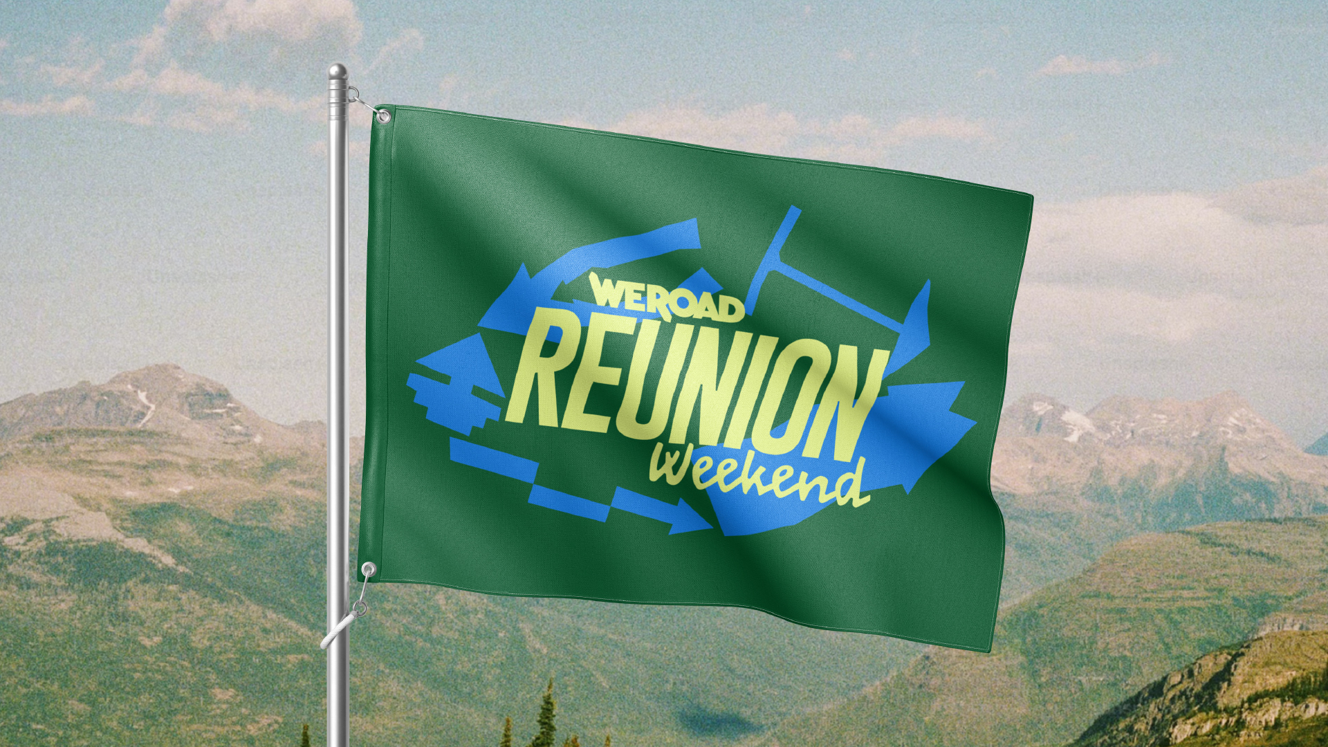
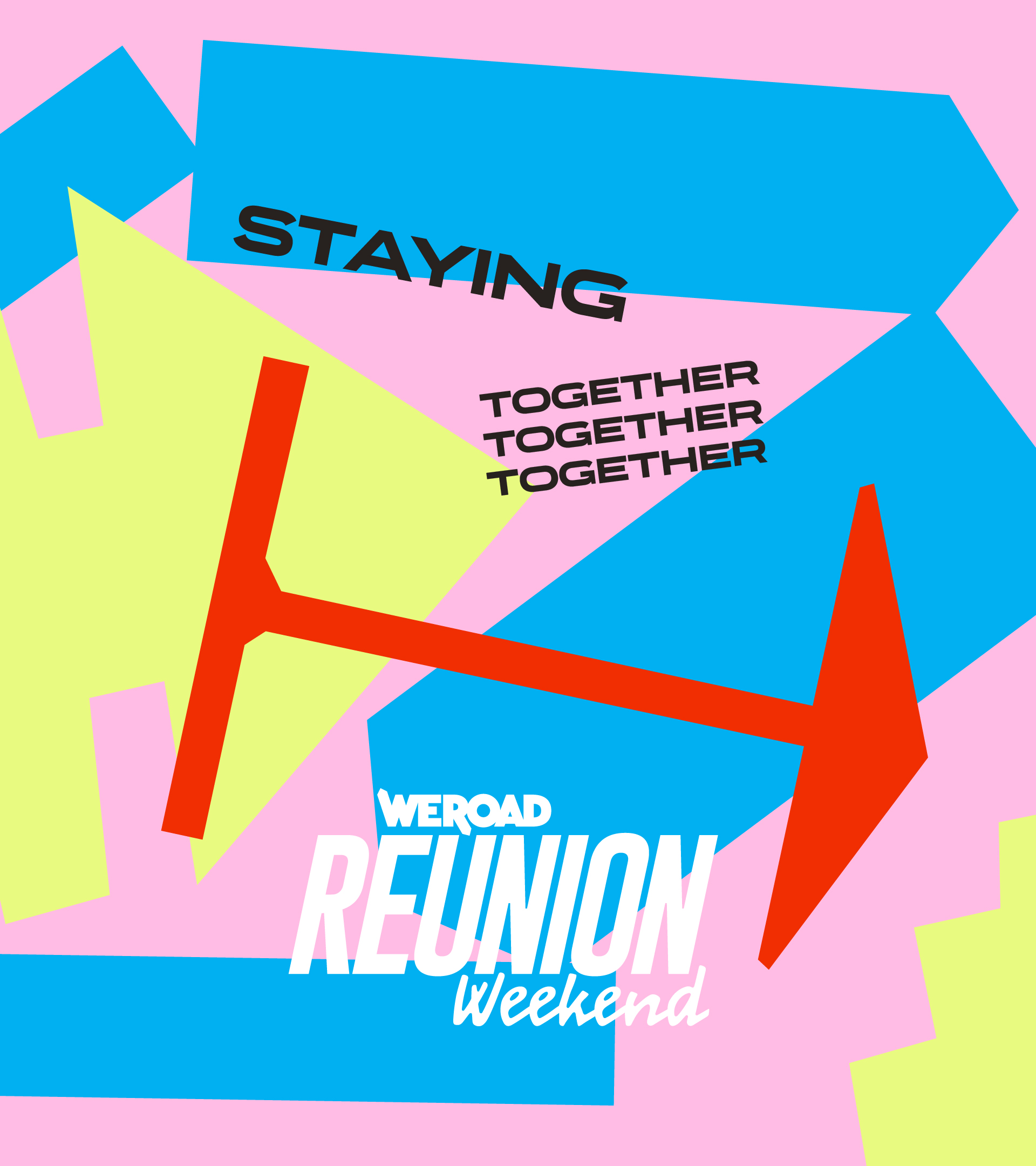
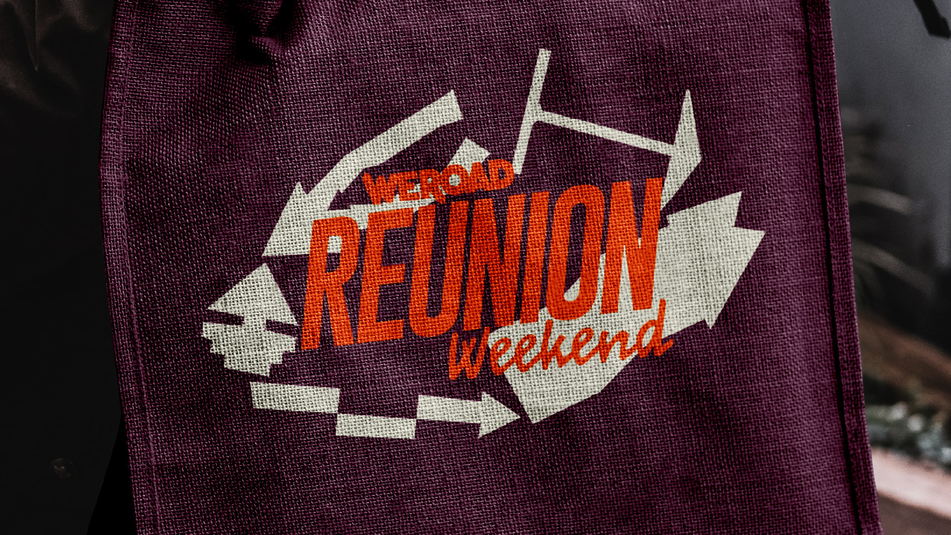
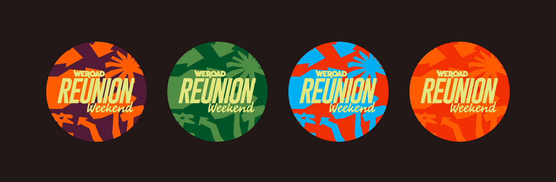
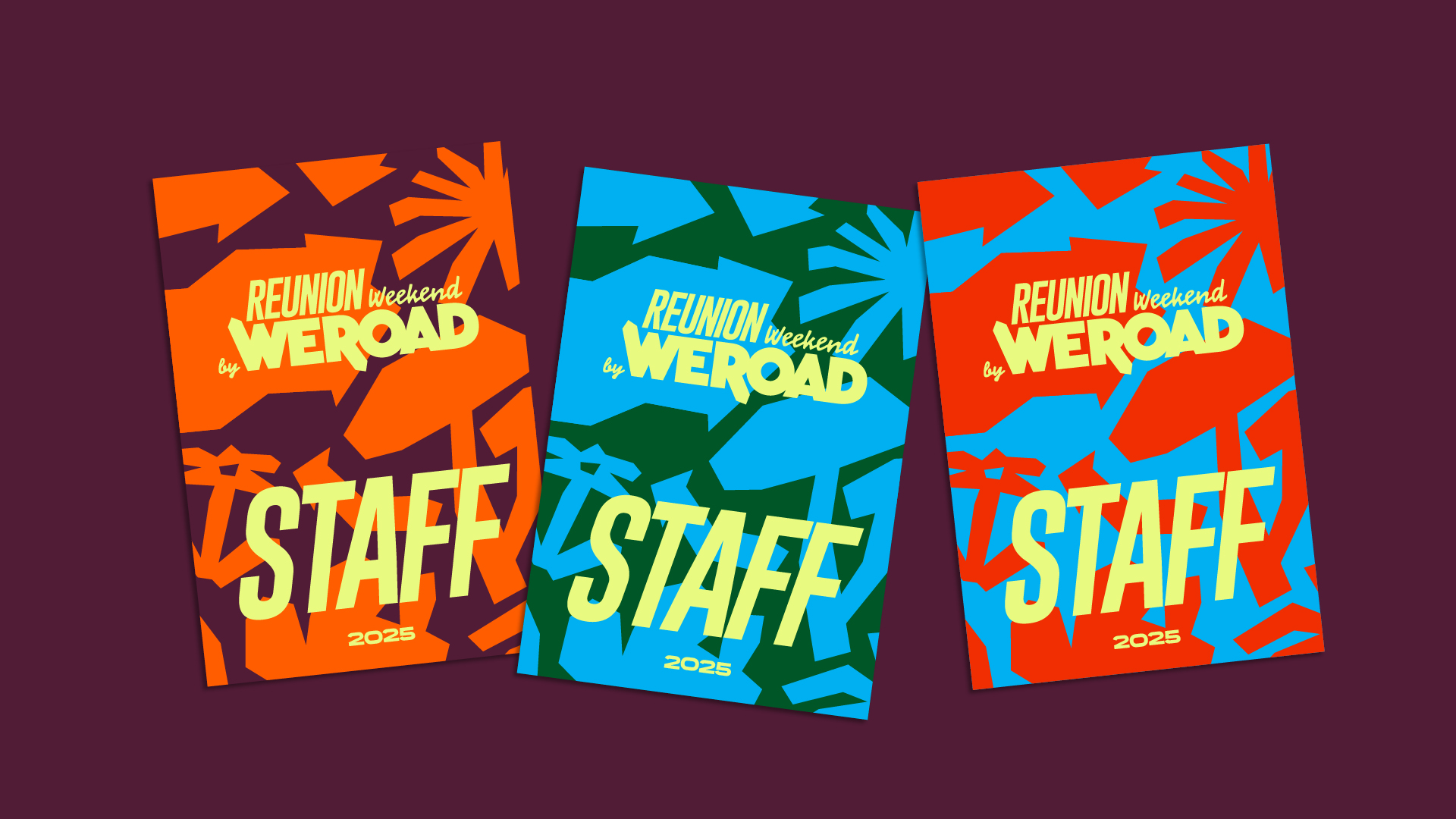
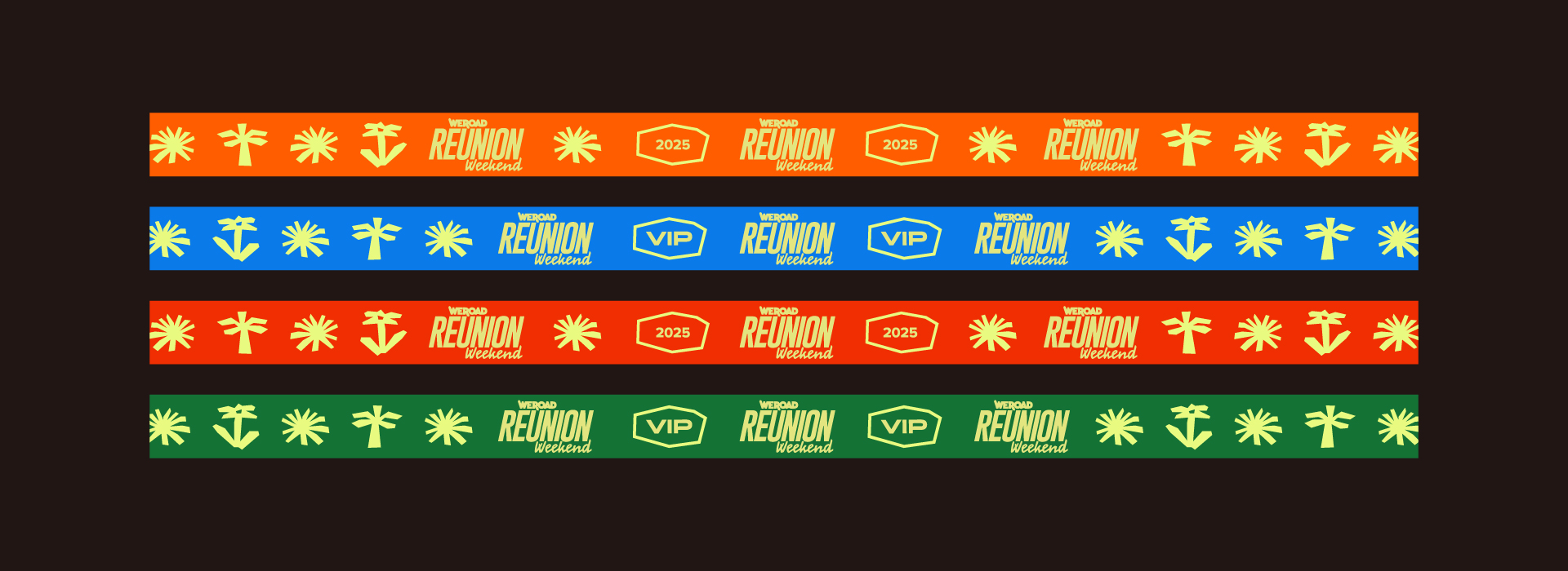
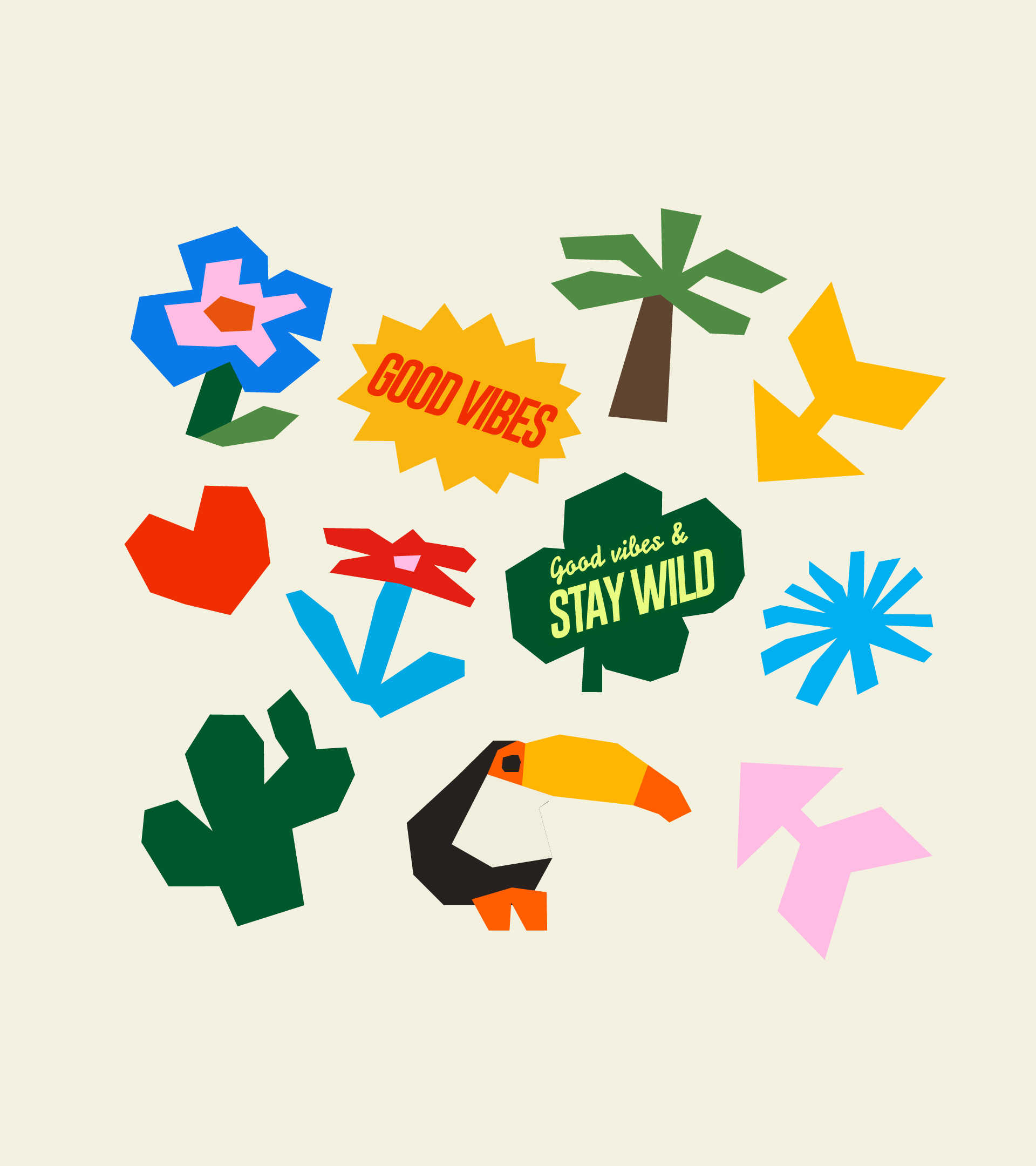
The arrow acts as a key visual, starting as a symbol and concept, and becoming a recognizable graphic element both across the festival’s physical spaces and in its digital presence. Ultimately defining the visual language used through the identity and its illustration, using a broken line, sharp but manual and warm.
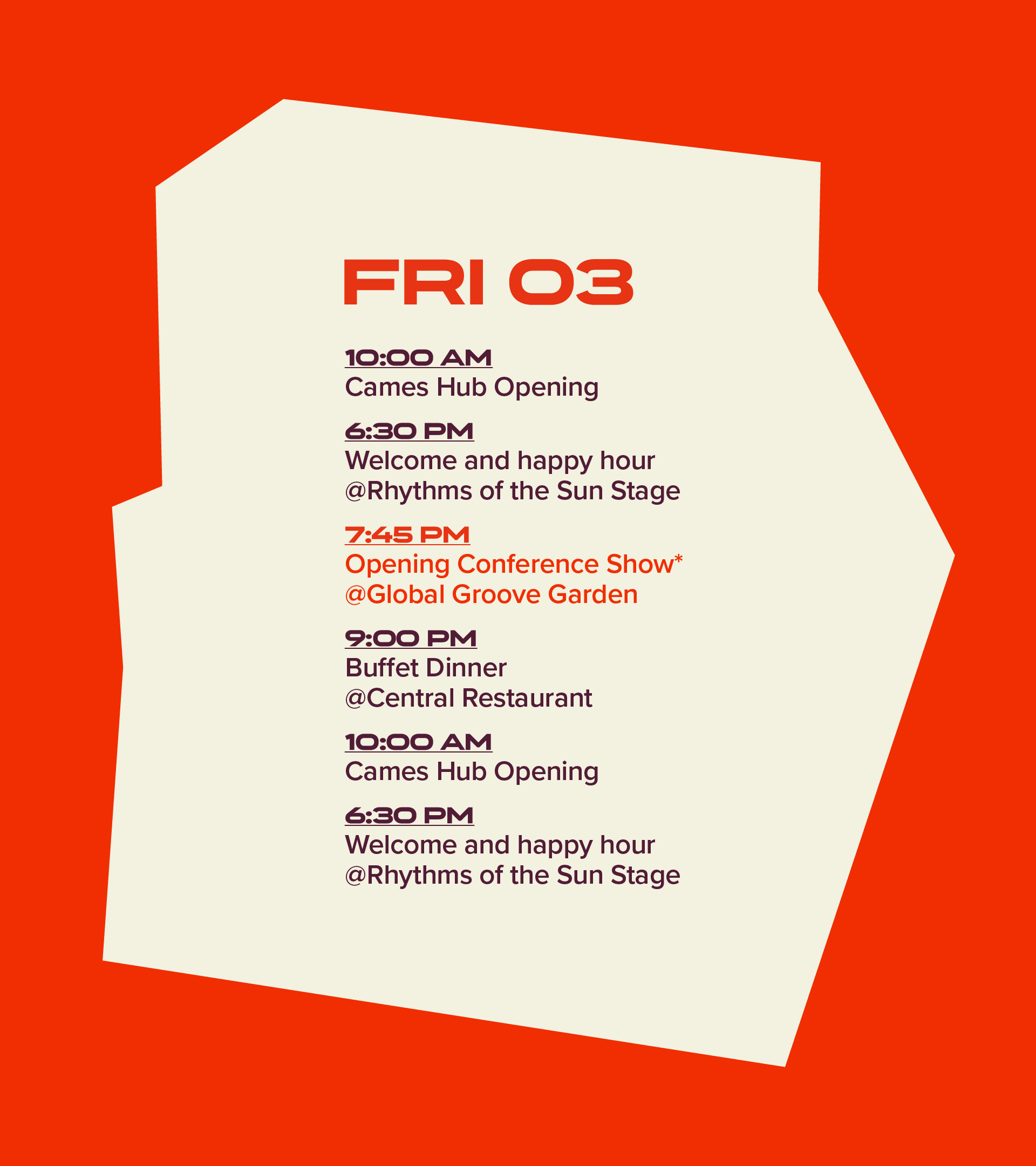
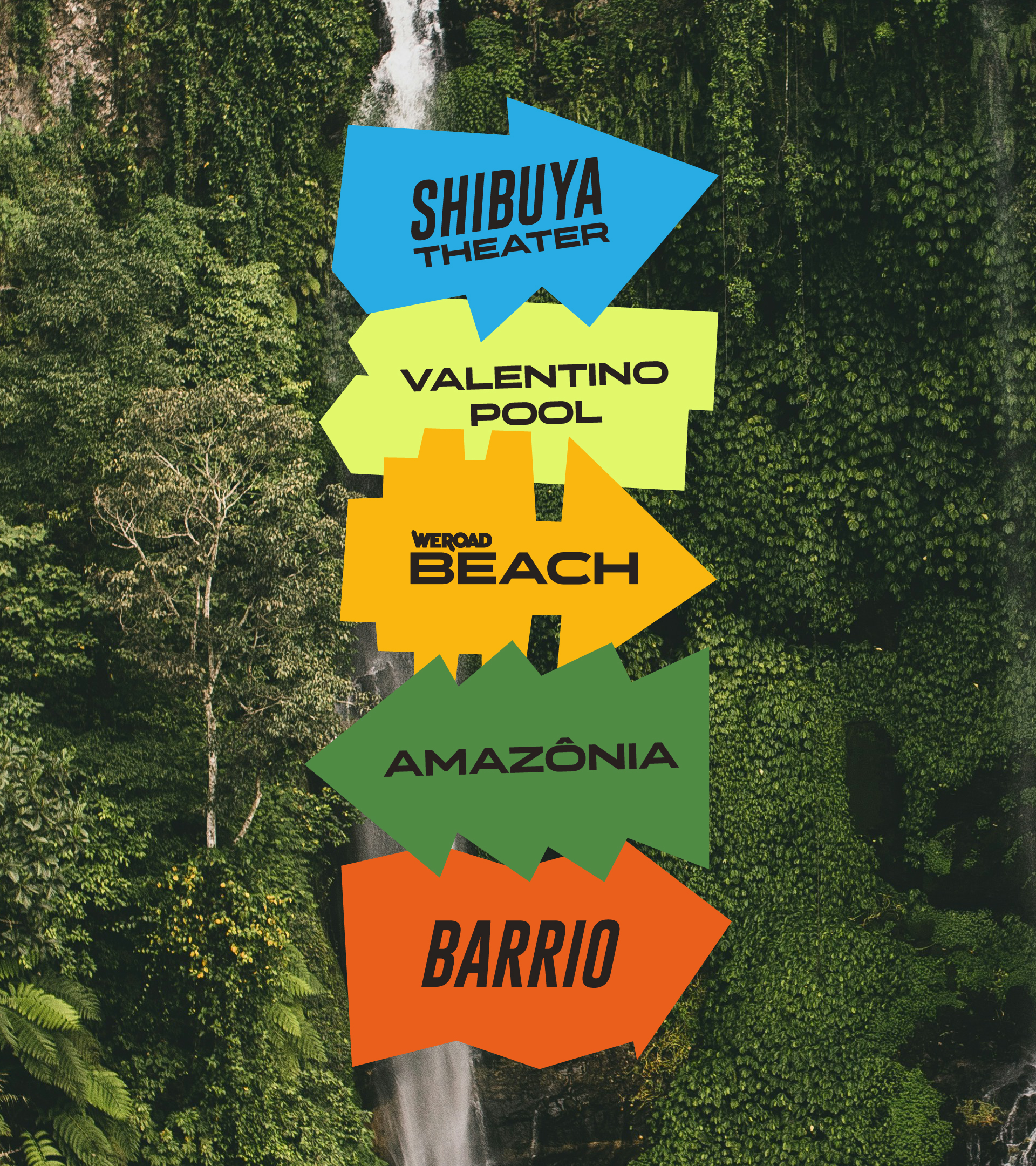
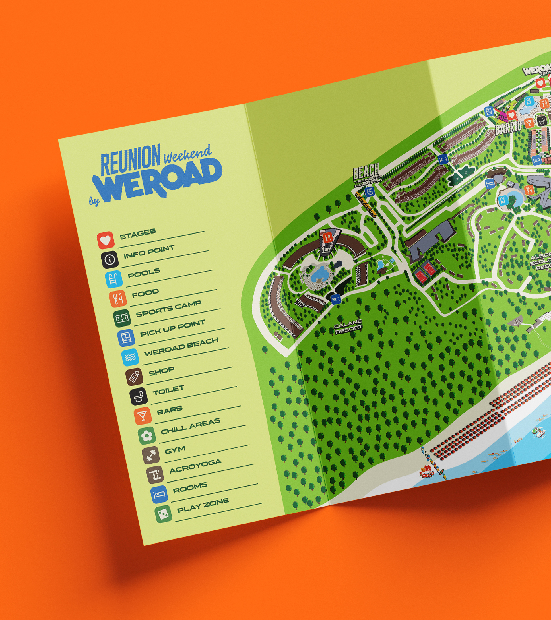
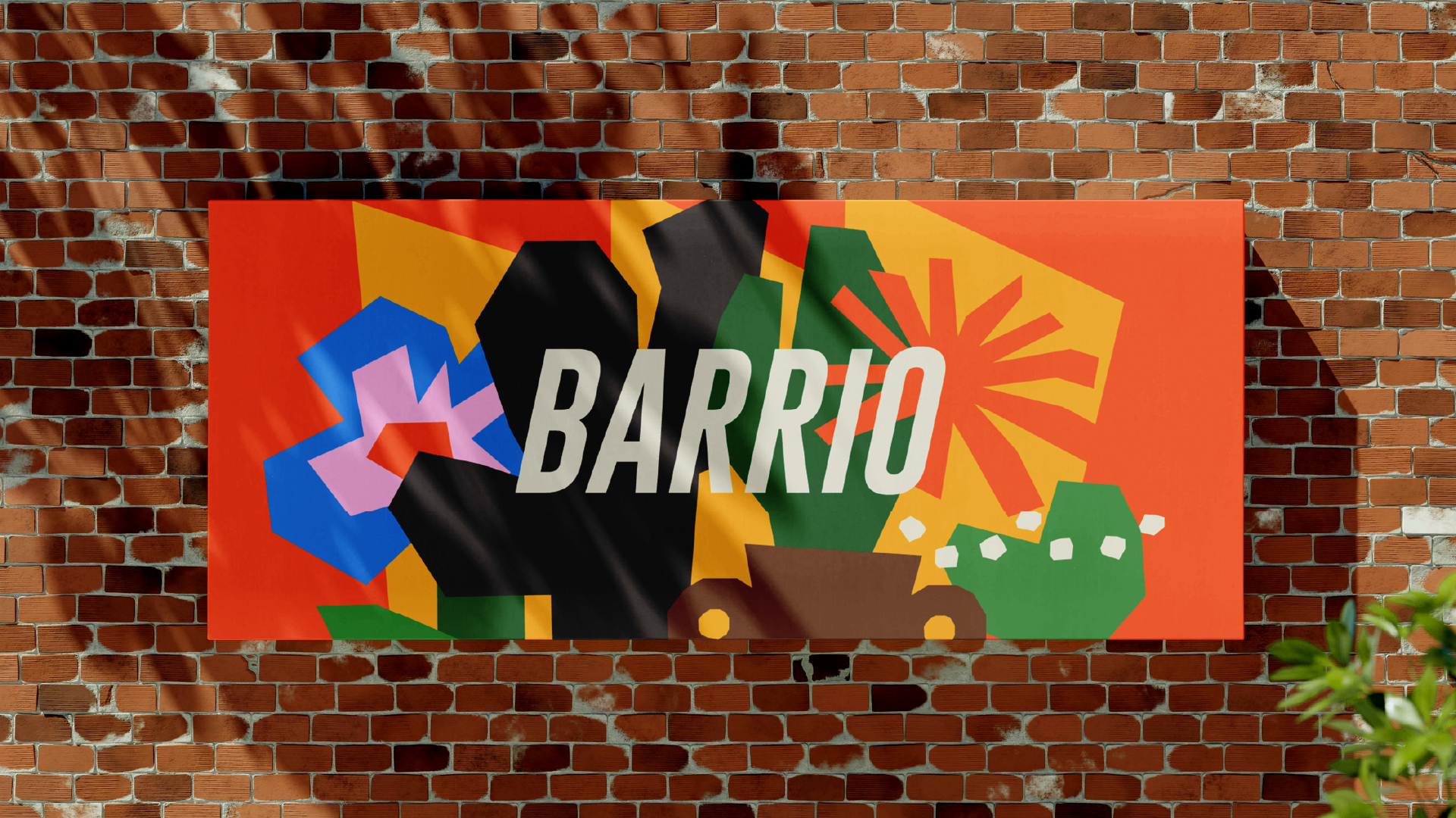
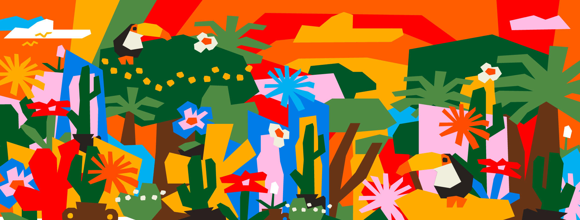
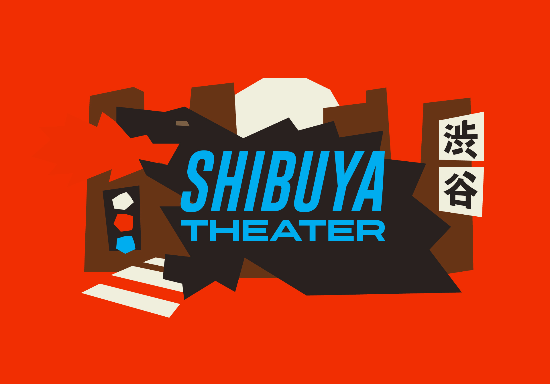
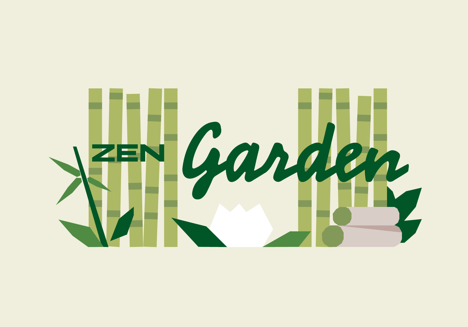
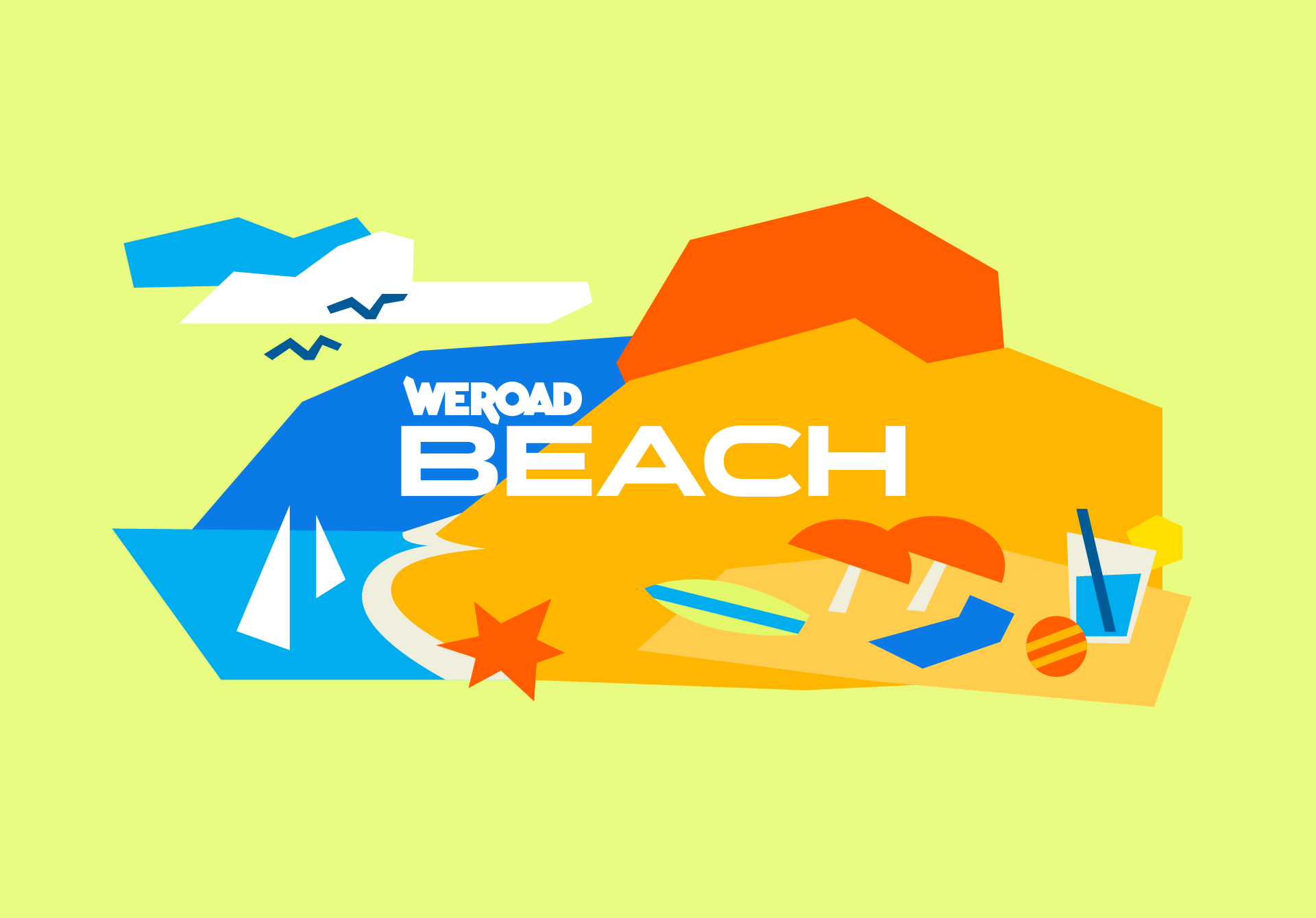
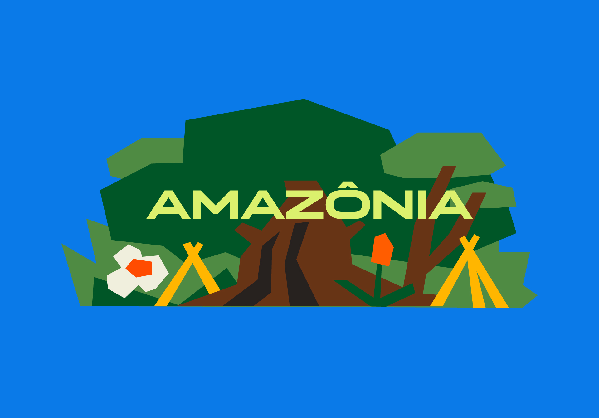
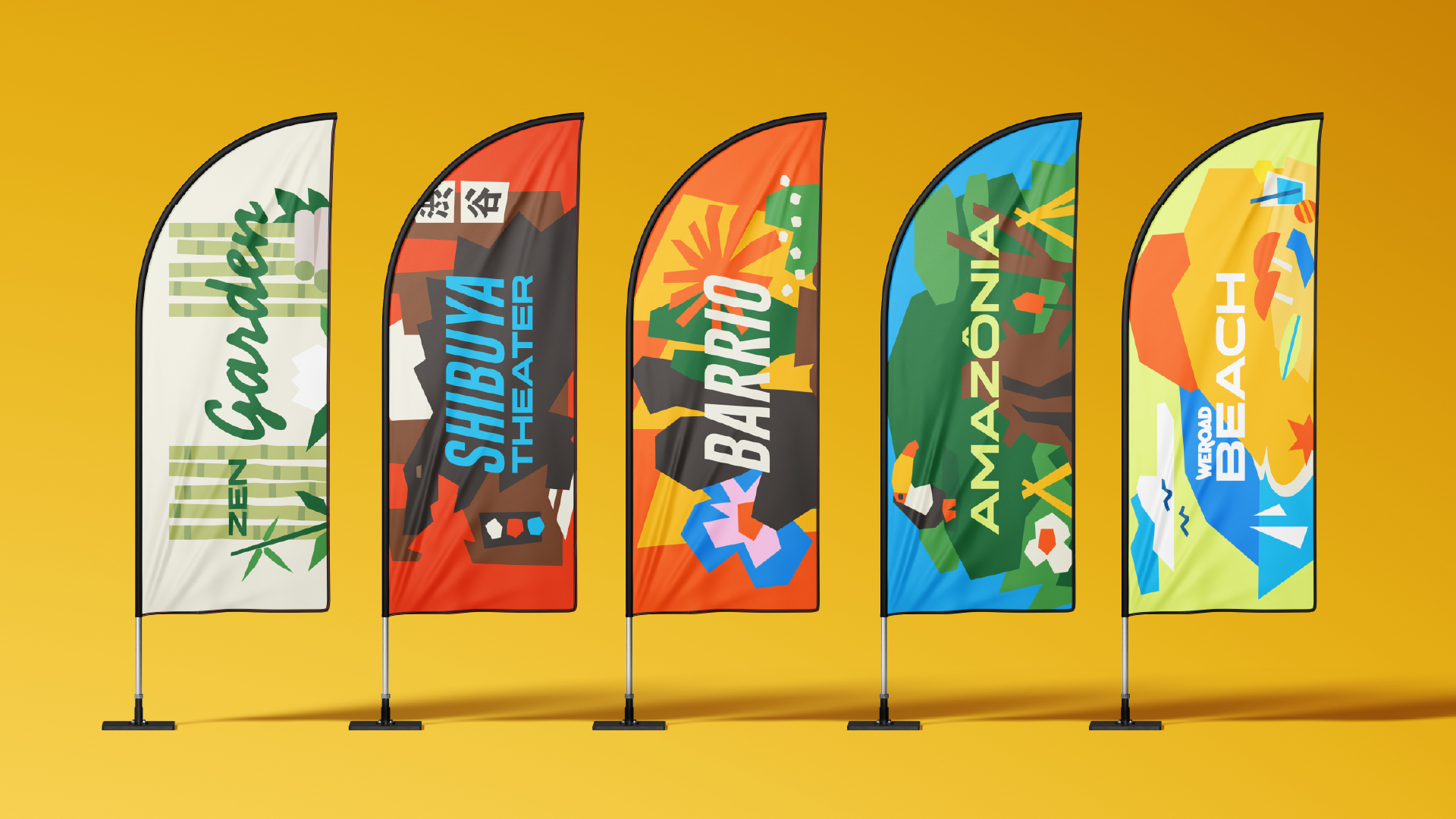
The Reunion was structured as a multi-activity, multicultural weekend. The WeRoad team created distinct areas for different moods and times of day. Each location had its own name and identity, inspired by different places and cultures.
The graphic design helped set the mood for each area while staying coherent with the Festival Identity and expanding the Reunion world. Many elements created for these areas were so well-received that they were incorporated into the main identity, prints, and applications throughout the festival.